

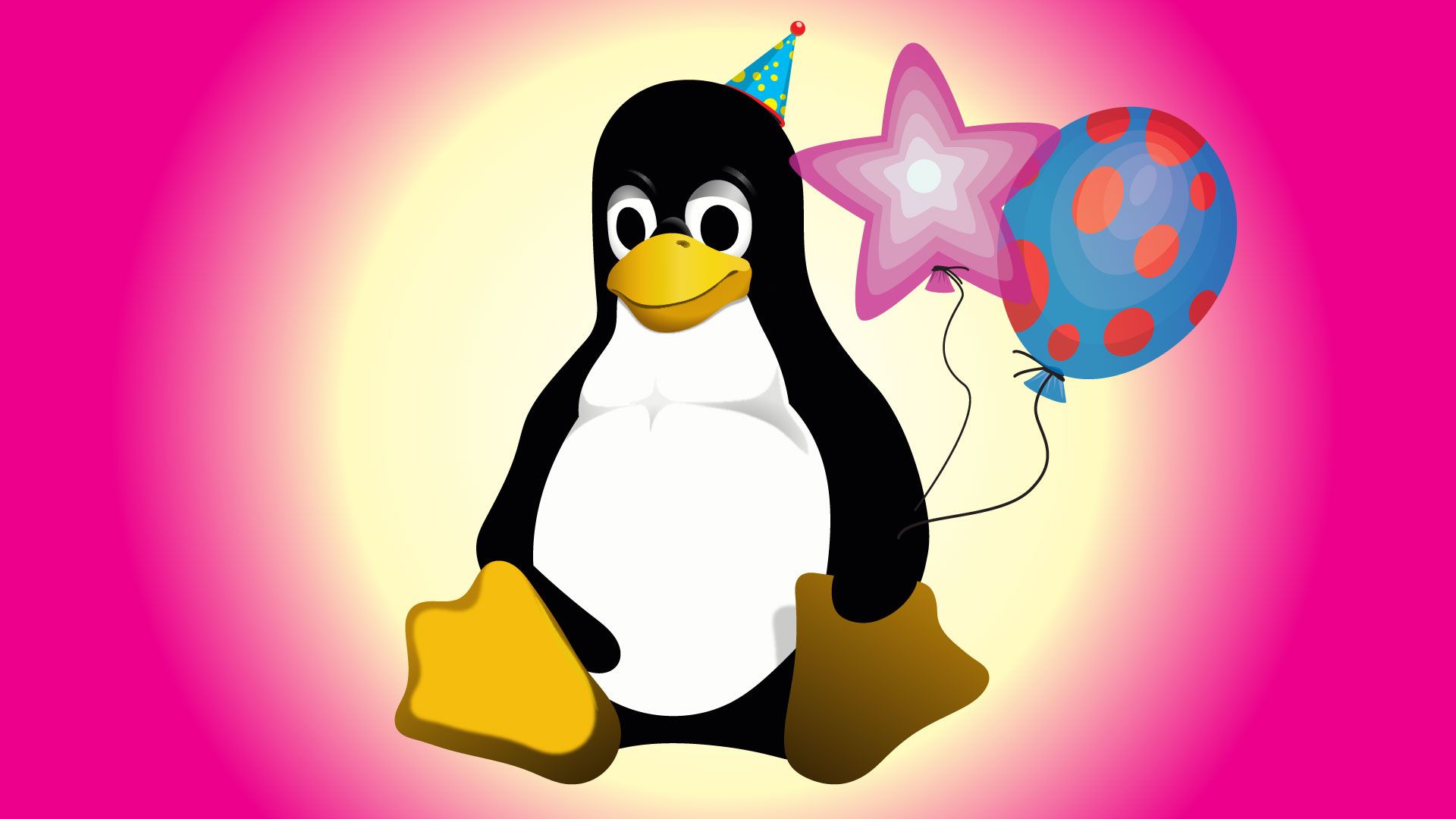
had to be overweight like it had eaten a bucketful of herring, as the only other kind of happy penguin is one that has ‘just gotten laid,’
Honestly I think Tux still looks more like he’s just gotten laid rather than feeling full from eating but that’s just me.
Maybe he be eating some other kinda fish tho nawmeen
the so called furry inflation
Will I be hated and insulted if I say I never liked it much?
It definitely needs a more artistic touch. I feel like it suffers from the lingering open source dullness.
No hate for FOSS, but many of its brandings could use some more expressive color pallettes and dynamic designs. Tux is literally a black & white penguin sitting around. Lol
Tux is just meant to be the logo of the kernel, which is not supposed to be exciting consumer product branding. Distros can and should improve their brand to be more exiting though
Erm actually… it is comprised of ‘black’ ‘white’ and ‘yellow’ and ‘grey’ wich appears in the ‘beak’ and ‘shadows’ inhales mucus i use Arch gnu/linux btw.
i h8 u
Oh 9!
Generic insult!
U r a shit
I’m not particularly fond of Tux, either, but I’m ok with penguins being the symbol for Linux. On my dual boot I prefer distro logos, it matches better with other OSs.
yes
I really wish Linux would drop it with the animal mascots thing, it so dated. Most everything else moved away from the concept when the 90s ended.
the most used server OS is using an animal mascot and its working for them
How else would we have characters for SuperTuxKart?
Nah, the Penguin is iconic at this point. Tux IS Linux!
I remember when Mac OS stopped using animal mascots right after the 90s ended… in 2012.
I really like the animal mascots, I think more projects should have them again.
Eh, it’s ok. And not as pervasive as you imply. Isn’t one of them a hat? And another a plant? And another three people holding hands?


